Dashboards can be amazing tools for helping organize the information you need on the fly but it took us some time to figure out what worked best. Here are my top 5 favorite dashboards that we use to help organize information:
Task Summary
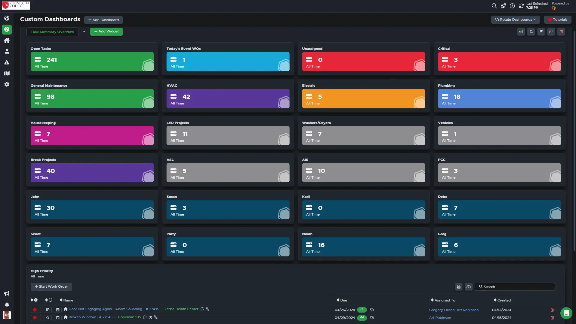
This is the first (and last) thing I check each workday (and sometimes on the weekends). When a doctor sees a patient they check their vitals (temperature, blood pressure, breathing, etc.) For our team this is a live look at our department’s vitals. Have all work orders been assigned? Are there any critically past due? Are any teams/individuals being overrun by frantic students desperately submitting 100 work orders before finals week? All of those questions can be answered from this page. I like to color code each label to help train my eyes to find the information I need quicker.
- Yellow = Electric
- Blue= Plumbing,
- Purple = HVAC
- Red = Needs Attention
*Pro Tip: Change the color of your dashboard title to green if you want it to show up at the top of your dashboard list.
Person Summary
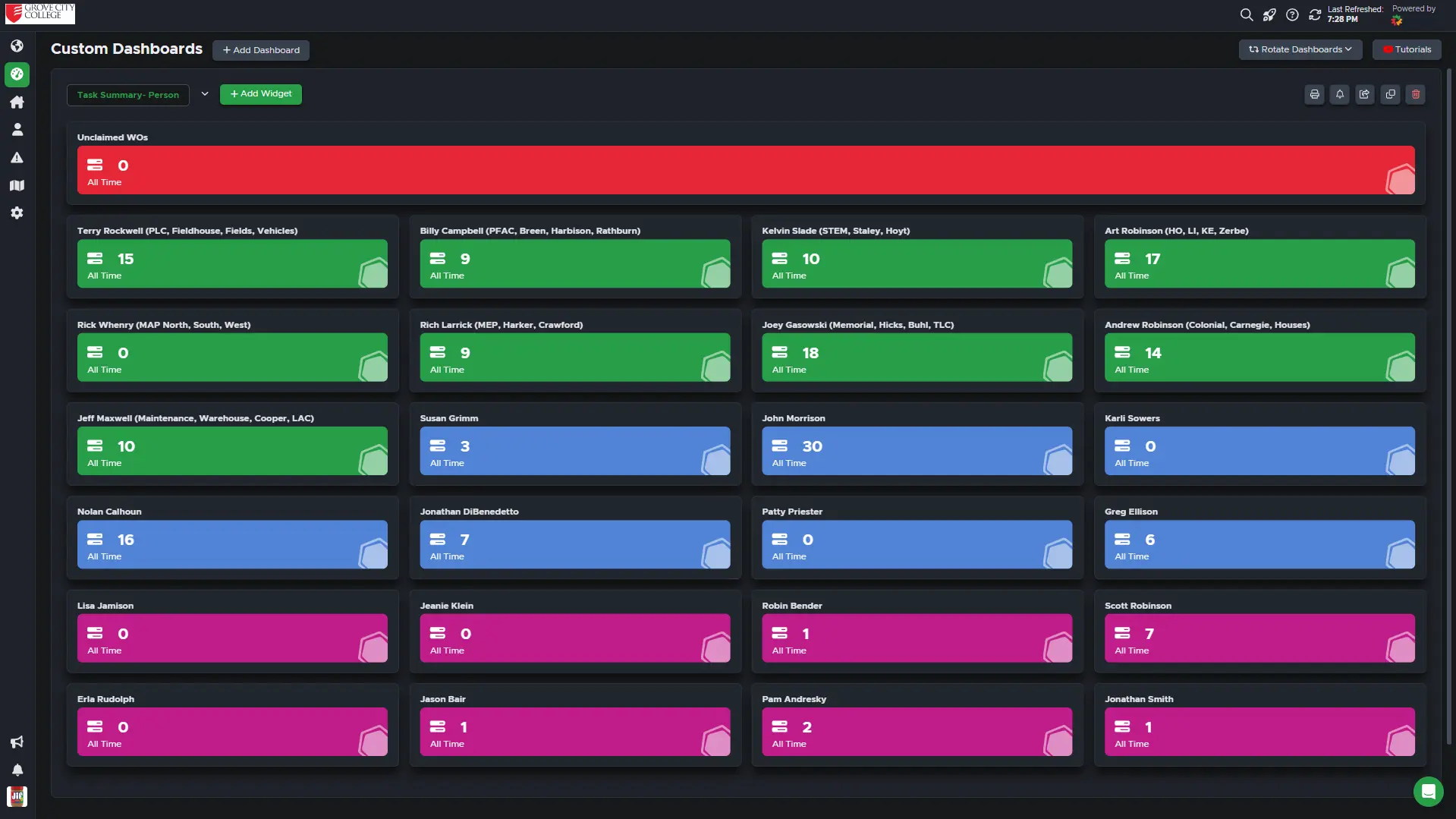
Our team is made up of 8 administrators, 9 general maintenance, 2 HVAC, 2 plumbers, 2 electricians, and 8 housekeeping supervisors. That’s a lot of people to check in on! This dashboard breaks down the largest groups so we can see where things stand with each individual. This is helpful when we see a really high number on task summary dashboard and want to investigate what is going on with that group of people. Color coordinated by team so we can easily identify which group they are a part of. General maintenance technicians (green) are assigned to specific buildings so they are listed next to each person. This allows us to quickly identify who has which building.
*Pro Tip: Add a label for “Unassigned work orders” on this dashboard and then you can easily see what each person is doing before throwing more work on their plate.
Building Summary
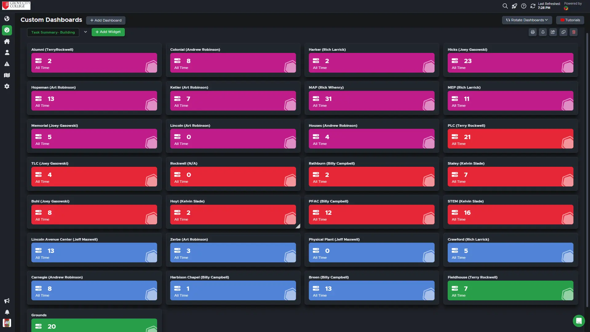
Our campus has over 30 buildings to maintain, and this dashboard helps us to quickly check in on each place. When special events occur, we review this dashboard to make sure things are prepped and under control. The academic calendar year lends itself to specific focuses so during the summer we need to prep the residence halls (pink) and while classes are in session we need to prioritize academic buildings (red). Similar to the person summary dashboard, we add the name of the general maintenance technician assigned to each building so we know who to contact with questions.
*Pro Tip- Tell your team to copy this dashboard and then change the filters to just their own work orders. This allows them to stack work orders by location and hammer out all of the issues that are located in the same place.
7 Day Review
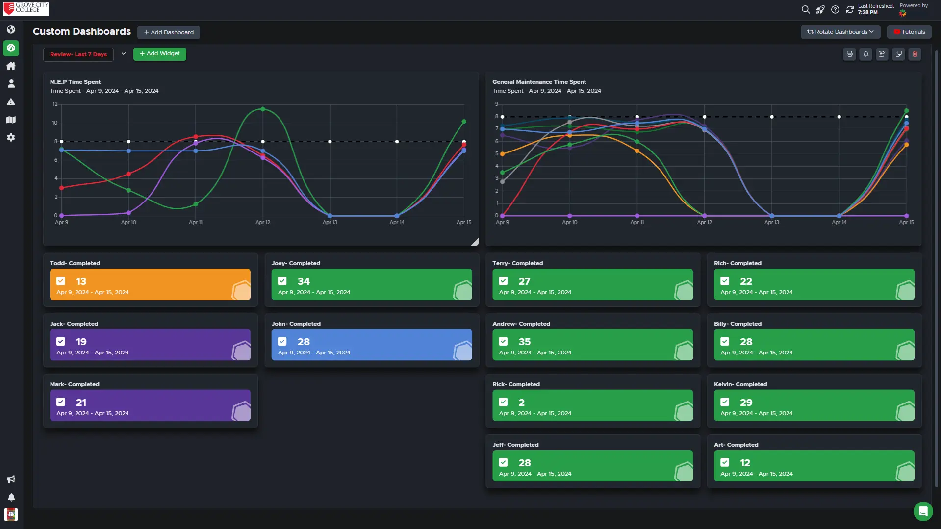
Sometimes we need to look back to move forward. This dashboard is a quick look at the past week to provide a look at what’s been accomplished. We like to check to see where our team is spending their time so we can make sure they don’t get stuck on a single project. We also want to hold them accountable and make sure they are logging their time each day. It doesn't tell the whole story and we certainly don’t want to reduce our success to a single value since there is much more of story to any given week than just how many work orders were completed by someone.
*Pro Tip: Make copies of this dashboard and change all the dates to go further back (30 days, 6 months, 1 year, etc.). It’s helpful to look back at the past and see how things are going now and you can even use the statistical data for guiding annual employee evaluations.
Asset Summary
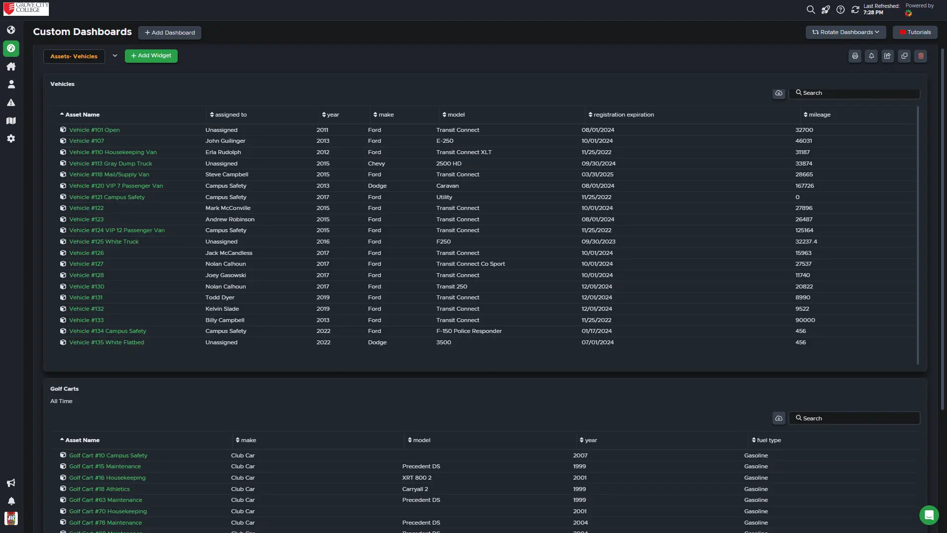
It took me a while to start creating dashboards around assets. I guess at first I didn’t see the advantages of listing the assets but after finding excel sheet after excel sheet that had been updated each year with new information it dawned on me that we needed to start tracking this information in Limble. We’ve made ones for elevators, generators, tool checkouts, vehicles, roofs, utility meters, backflows, and snowmelt systems. Add lots of custom fields to your assets so you can easily find replacement parts, track evaluation dates, and show your boss why you really need to get a new vehicle because you have the oldest car in the fleet (Pretty please, Susan!!!) You can sort the group by each field and can download the data into an excel spreadsheet when needed.
*Pro Tip: Link your fields to PMs so you can update the information regularly. We update vehicle registration, mileage, status, runtime hours, etc.
Your Turn
What I love about dashboards is how versatile they are and how easy they are to build. Do you have any dashboards that keep you from daily mental breakdowns? Show them off! Help others by showing them what’s possible so we can all build together!