We recently set up an API for Power BI so we can make some advanced reports from Limble. Here are a few that we've cooked up so far.
Year-Over-Year Data
The reports in Limble are great but one thing they can't do is show multiple years overlaying on the same graph. This graph shows how many tasks were completed by month. Each line is a different year so we can start to see trends in the year. Since we are a college it typically takes 4 years to identify a normal standard.
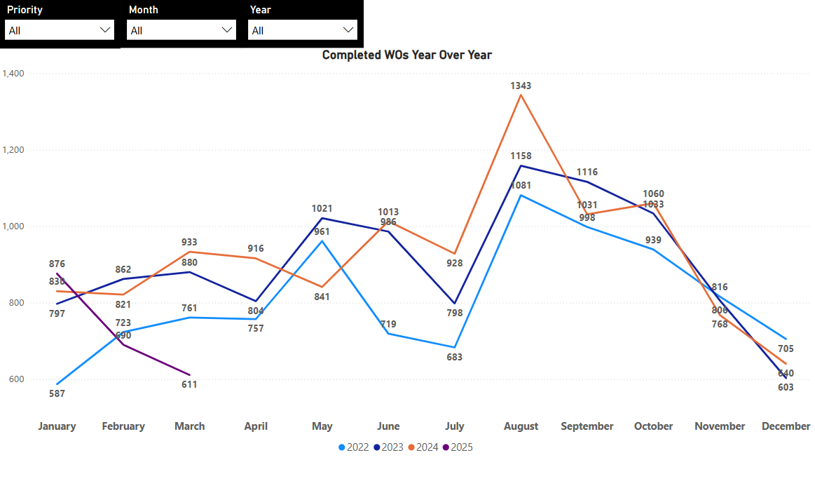
I added some slicers so we can include/exclude certain data points (priorities, months, years, etc.)
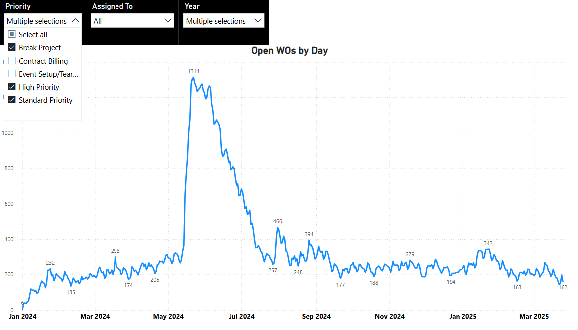
Open Work Orders on a Given Day
It's helpful to see how many work orders are being created or completed but we wanted to know how many tasks are open on a given day. This chart took a little coding to figure out. We ended up counting if a date was >= creation date AND <= Completion Date. This allows us to see when we are backlogged and how long it takes us to get back down to our normal work order amount. This helps us know when to shift around annual PMs to match the slower parts of the year.
Building Administrator Reports
Many of our buildings have an administrator who is responsible for day to day functions. They would very much like to know what work orders are currently open in their spaces so they can be aware of what has been submitted and communicate to anyone who needs to know.
We created a report that shows an illustrated map of campus. Overview information was added to the left hand side and can also be clicked on to focus on those specific tasks.
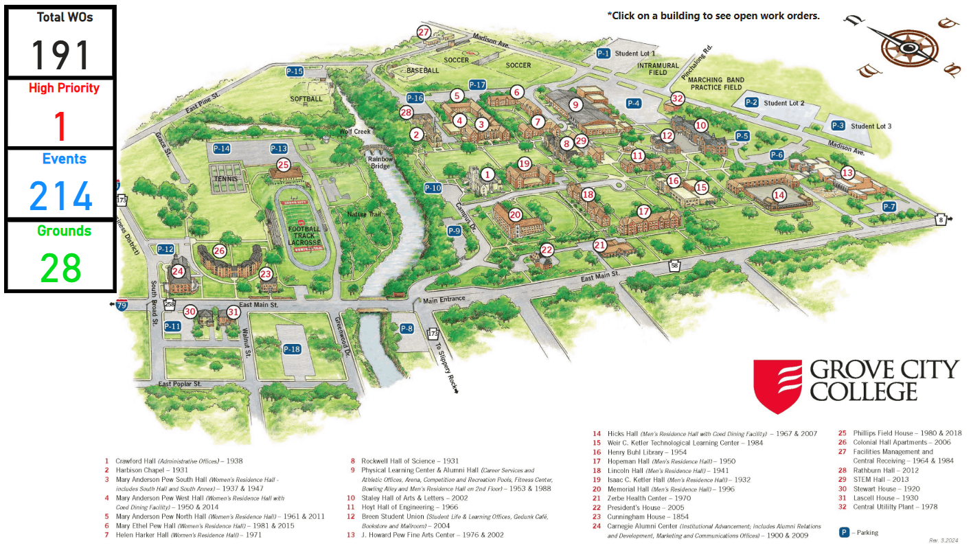
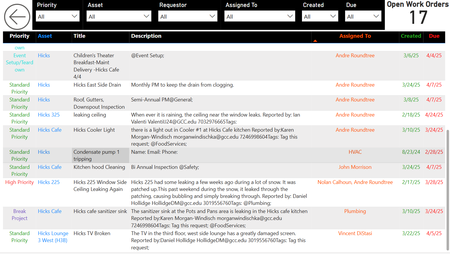
We added hyperlinks so you can click on each building and it will show a list of open work orders.
We set up user permissions so the admins can easily access this report. It's been a great way to streamline communication among employees of the college.
Other Report Ideas:
- Cross check employee time cards (Kronos) with reported time logged (Limble). This would show what percentage of actual work is logged and how much time is lost on average to non-work related activity.
- Visual map of how much money (labor, parts, invoices) is tied to each building. Create color code to show which buildings have the highest maintenance cost per square footage.
Any else using Power BI? What reports are you using?